Balto's portrait
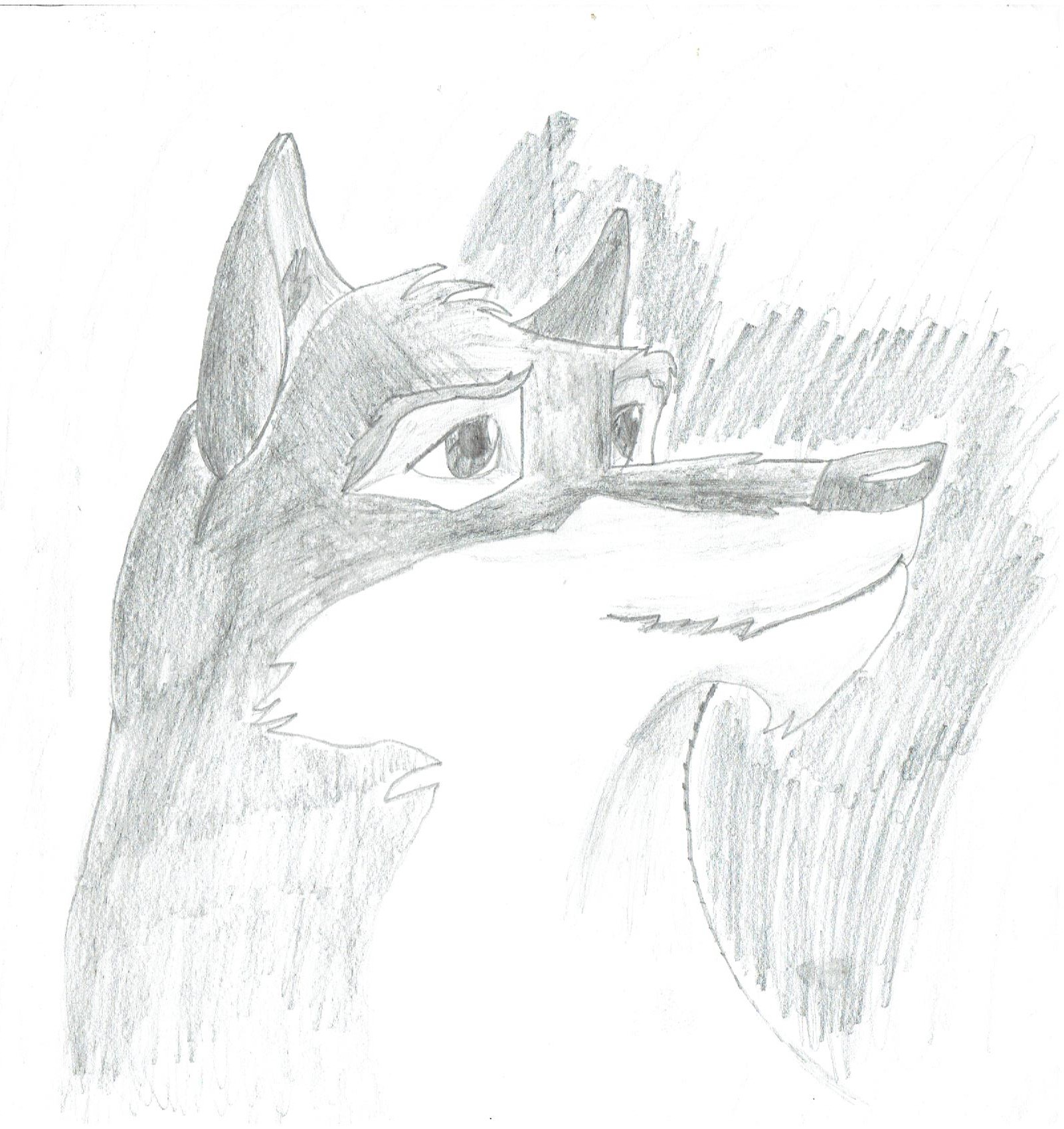
For many artists who grew up in the 90s and early 2000s, the film Balto (1995) was a visual masterpiece that sparked a lifelong interest in drawing animals mostly wolves if were honest. Based loosely on the true story of the 1925 serum run to Nome, the film's character designs-led by the legendary animators at Amblimation-offered a perfect blend of canine realism and expressive animation. This piece, completed in 2009, marks a very specific turning point in my personal artwork style. At the time, I was a huge fan of the movie, and I decided to challenge myself by recreating the iconic portrait found on the front of the Balto DVD case. What makes this drawing special isn't just the subject matter, but what it represented for my skill level: it was my first massive leap toward a more accurate and polished art style!
Before this 2009 portrait, much of my work was very simple and "cartoony," like my earlier VeggieTales or Chowdersketches. However, drawing Balto forced me to look at anatomy and deeper detail in a whole new way. 1.Proportion and Symmetry: When you are drawing a portrait from a DVD cover, there is no room for error. You have to ensure the eyes are level, the snout is the correct length, and the ears are positioned naturally on the skull. 2.The Wolf-Dog Aesthetic: Balto is a "half-breed," a mix of Siberian Husky and Wolf. Capturing that specific look meant balancing the friendly, domestic features of a dog with the sharp, majestic, and rugged features of a wolf. 3.Fur Texture: Unlike drawing a smooth cucumber or a rock monster, a wolf-dog requires "layering." This was the first time I really experimented with using short, directional strokes intentional shading I just learned in art school to mimic the flow of thick mammal fur.
Another reason for the improvement seen in this piece was the better use of teckniques. While my earlier works were just basic outlining, for this portrait, I transitioned to different advaned pencil techniques for the first time. 1.Deep Shadows from shading: for the first time I used shading to make the artwork feel more realistic, this allowed me to get those rich, dark blacks in Balto's pupils and the shadows under his chin. 2.Fine Details: I also focused on finer detail like fur pattern and the fine whiskers and the subtle highlights on the nose. 3.Paper Choice: Even though I was still using white printing paper, the new techniques made it soo much better almost an exact copy, allowing for smoother blending and a "majestic" finish that looked far more professional than my previous sketches.
Some young artists might feel like they shouldn't "copy" existing art, but studying a professional movie poster or DVD cover is one of the best ways to learn. The artists who designed the Balto cover were masters of composition. By recreating that image, I was inadvertently learning about how to frame a face and how to use "eye contact" to create a close visual copy of the first it makes the same emotional connection with the viewer. This portrait turned out "wonderful" because it was the result of patience and observation. It taught me that if I slowed down and really looked at my reference, I could produce something that didn't just look like a "drawing," but felt like a living character.
Looking back from today's perspective, the 2009 Balto Portrait remains a favorite. It represents the moment I realized that I had the potential to do more than just doodle-I had the potential to create art that was "majestic." It was the bridge between my childhood cartoons and my more mature, detailed illustrations. For anyone looking at this piece in the gallery, I hope it serves as proof that growth is possible for every artist. All it takes is a subject you love, a slightly better set of pencils, and the willingness to take a "massive leap" into a new style. Balto's story is one of perseverance against the odds, and in a small way, this drawing represents my own perseverance in mastering the craft of drawing.
Date: 2009
Medium: Printing white paper W art pencils